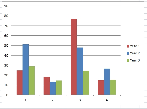
We started our Riot in October of 2008. In the interest of making my bookkeeping easier, I’m going to count Year Three as a 14 month year. The percentages (of US National Average) for Year Three for (1) Gasoline, (2) Electricity, (3) Heating Oil and (4) Water are as follows:
| year three | 29.1 | 14.6 | 24.5 | 15.3 |
| year two | 51.2 | 13.4 | 48.0 | 26.5 |
| year one | 24.8 | 18.2 | 77 | 15 |
Next year I’ll calculate not by percentage but by solid numbers (gallons, KwH), because I am sure that with the fluctuating economy, etc., the consumption of the Average US household changes, and I’m not sure if these changes are reflected in the admittedly simple Riot calculator. Still, it’s a baseline.
1. Gasoline. Gasoline is still our bugbear. Year Two is so high because we calculated in our trip to Europe, which same trip we took this year, though I’ve not figured it in because I don’t know how anymore. So, by all intents and purposes, our consumption should still be up there in the 50th percentile.
2. Electricity. Year Three was of course the year we installed solar (switched on in August). Â Solar is actually more costly than the Wind energy we were purchasing from NSTAR, so while we kept our consumption level, our percentage went up a little compared to Year Two.
3. Heating Oil. As you can see, we made the most headway with heating oil in Year Two, when we installed the woodstove. That we cut the consumption of heating oil even further in Year Three is due to three factors: (1) so far, to not having experienced a Winter, (2) to being even more vigilant with our woodstove than before when it did get cold, and (3) to discovering that our oil furnace is more efficient than I had been figuring (I recalculated for Year Three only).
4. Water. The fact that the growing season was moderately wet and that the garden was anyway rather neglected during Year Three is partially the cause for our water consumption going back down to Year One standards.
All in all, these comparisons are useful only as a way to keep us on the straight path and indicating the most problematic areas, in this case reconfirming gasoline as something that could really, again, bear improving upon. And we might just do that, in Year Four!


Nice summary. How did you do that nice chart? I think the calculator is just a nice jumping off point for figuring and working on the numbers that are important for you. I understand the focus on getting down to 10% of US average, but that’s so hard to deny yourself that much when so many others are so wasteful. It’s getting cold tonight, I’m wearing my hat in the house.